Tuesday, September 7, 2010

Menu Board

First, I have to start out by saying that I totally stole this from Stephanie Lynn at Under The Table and Dreaming, and she was kind enough to make the 'days of the week' printable available for everyone to use!

I started with this hot mess from the thrift store:


Yes, those would be flowers, from a calendar or magazine, decoupaged onto some fabric. But before I removed it, I tore the trim off first. Ahhh, how I love dismantling ugliness!

I took absolutely no pictures of the process because it was so straight-forward. I just painted the frame a flat black, glued a piece of scrap burlap to the backing, printed and cut out the days of the week, typed 'MENU' in Word and added a border, then hot glued them onto the burlap.

Super easy!


And super cute!


Sunday, September 5, 2010

Lightning McQueen Painting

I decided a while back that Elijah would be having a Lightning McQueen birthday since he is pretty much obsessed with the movie, and I knew right away I wanted to paint a mural to use as a focal point. I have a little confession to make though - his birthday isn't until December! It's okay, you can call me crazy. I've already come to terms with that fact. No, but in all honesty, I just wanted to have it done before we move in 5 weeks (is it really only 5 weeks now??).
I was planning on doing a tutorial until I realized that would make for a ridiculously long post that nobody would want to read, so I am just showing you guys how things evolved and then I will point out a few important parts.

First, I started with a 4x5ft drop cloth from Lowe's (I want to say it cost less than $5). I ironed it, but the folds seemed to come right back. It's okay though because the paint flattens it out.
I found an image of Lightning McQueen on the internet (from here on out he will be called LM 'cause it's so much easier to type!), cropped it, then printed it out. I then made a grid on the paper with the lines spaced an inch apart. There was a little bit of ungridded (not so sure that is a real word) space that I just cut off. I then made a grid on the drop cloth, spaced a foot apart, and sketched LM onto the drop cloth the best I could.
TIP: Don't make the lines too dark because they will show through the paint. It's kind of hard to erase the lines so it's better too just draw them lightly.


You could use primer, which would probably give you a better end result, but since I am going to be rolling this up for our move, I decided to skip primer so that the paint wouldn't be too thick.

With this next picture, I had painted the base coat for his body and 2 of the tires. I get a little ADD when I paint and like to skip to some detail because I'm just a tad bit impatient and want to see how things will look, like, now! Hence the reason I painted the headlights and his mouth and did some shading.


He was still looking really funky, so I went ahead and painted his eyes. I had such a hard time getting the right eye color, but it turned out close enough.


Next, I painted the '95' and the base coat for the rims. Just ignore the black splotch under his back tire. I wasn't paying attention and I painted way out of the line ::blush::


Next up was the rim detail and learning that the tire wasn't quite round. Oh, and he also got his lightning symbol.


The picture below shows how extremely crooked I made the line for his hood. I had to go back and repaint it, but you can still see the original line in the finished product. Oops!


The background in the movie is very toned down and hazy so I mixed some blue paint with lots of white to get a good sky color.


I completely forgot to take pics from the last picture to the finish, so here is the finished product!
(Please ignore the totally crooked background and just pretend I did it on purpose to make it look like a hill)


Alright, now for some details!

I think when people think of shadows, they automatically think of black, but that isn't always the case. I actually used a dark, smoky blue. I mixed some black with the blue to use where the shadow meets his body/tires.


I also used a light blue to paint most of his teeth and reserved the bright white for the highlights.


To create a hazy look for the mountains, I just painted sloppily so that I wouldn't get a clean line for the outline. I had some issues with these and think they could use some work, but I am so done painting!


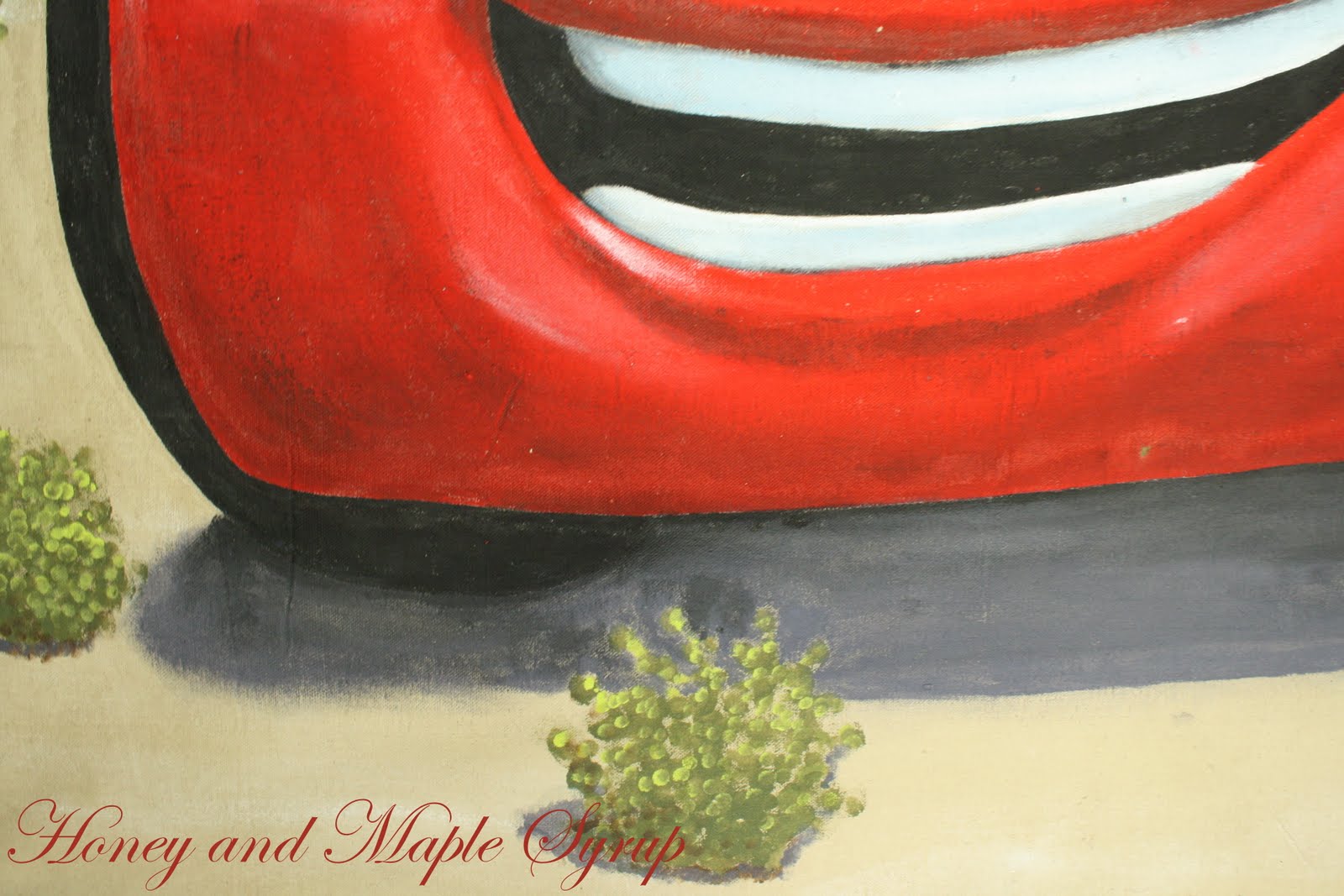
For the plants, I used a spouncer for the dark green and then an itty bitty spouncer for the light green highlights. I also used the little spouncer to create shadows with smoky blue.


For the little plants in the background, I used the small spouncer and made the plants smaller and more condensed as they got closer to the mountains. I also didn't use the light green for highlighting because colors look less vivid the further an object is from you.


Here's a closeup of the tire just because =)


It's hard to tell in this picture, but I added silver sparkles to his thunder bolt.


And here is the finished product again.


I'm not going to say this project was easy, but I know Elijah will love it which will make it all worth it. Stay tuned for more Cars projects. I have some more ideas whirling around in my crazy head and will show you guys how it all comes together in just a few months!

If any of you decide to try painting something like this, I would love to see how it turns out!  FYI the paint will seep through the back, so I suggest using a plastic drop cloth underneath. Also, the canvas will stretch as you paint the edges, so when you hang it, you will need to tack the bottom corners down too.


All Thingz Related

UndertheTableandDreaming

Simpsonized Crafts


Funky Junk's Sat Nite Special

Monday, August 30, 2010

Starfish Video

Here is a great little video about starfish. It makes me laugh everytime - I hope you find it funny too!


Thursday, August 26, 2010

Kitchen Artwork

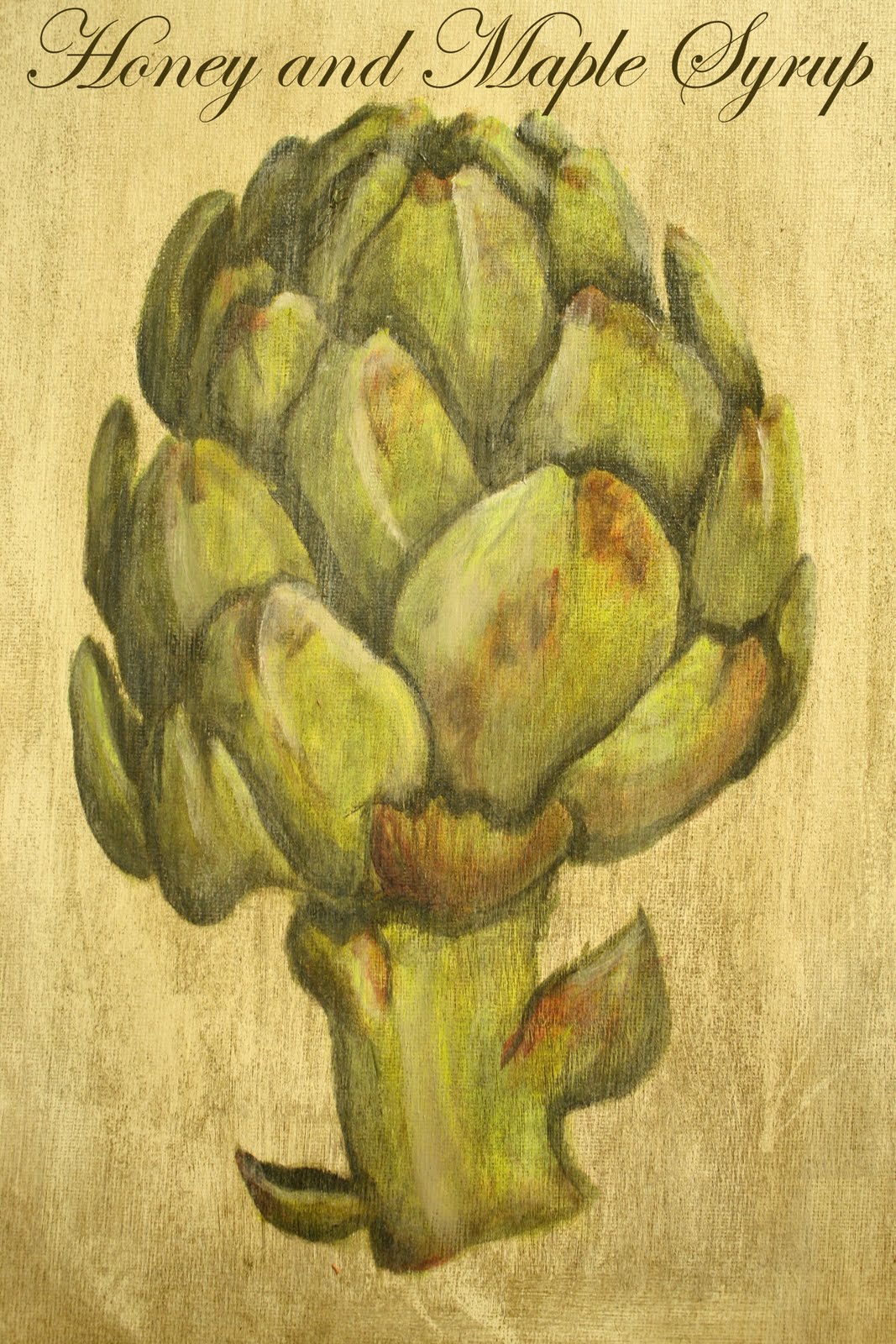
Do you guys remember the kitchen towel holder that I just made? And do you remember how I had no idea what to do with the area above the knobs? Well, you guys gave me some GREAT suggestions and I had an idea of what I was going to do, until I got a random memory of how I wanted to use artichokes in the kitchen. Dilemma solved!...Well, sort of. I didn't want to go searching for the perfect artichoke print, which meant I would have to paint my own, and I haven't painted in a really long time (think last Christmas!), which meant super duper rusty painting skills...but alas, I bit the bullet and went to Michael's for some canvas. I bought a 3-pack of 11x14 canvases and used a coupon, so it came out to somewhere around $3 total.

Are you guys ready for blogland's worst tutorial ever? Sorry, but when I paint I get in a zone and kinda sorta forget to take pictures =)

So once the little guy was down for his nap, I brought out my good ol' paint supplies and painted my canvas white. Then I mixed what was supposed to be a lime green (according to the bottle, but it so wasn't the color I was expecting!) and just a smidgen of black.


TIP: It only takes a teeny tiny itty bitty amount of black to darken something and a lot of white to lighten something.

I didn't have an actual artichoke in front of me so I found an artichoke painting online and used it as a reference (is that like stealing??). I then drew an artichoke on my canvas with pencil and roughly filled in the spaces. I left some white around the edges so that it didn't all blend together.


Next, I mixed in a little bit more black and did some shading.


This is the point in my paintings where I usually think it looks so ugly and there is no way to turn it around and then I have to give myself a little pep talk and try and convince myself that it will get better.
So after my convo with myself, I took some black to do some more shading, and I also added a little bit of red on random spots.

TIP: Water is your best friend if you are using acrylics! If you get too much paint on your canvas, you can easily take some off or blend it if you add water. Sometimes I'll even dip my finger in water instead of using a brush.


It was looking a wee bit bright and the lines were too harsh for me at this point so I did a very light white wash over the entire artichoke and also added some Minwax Dark Walnut  to age the painting.


But I really didn't like how muddy the stain looked, so I went back and did another white wash over the entire piece, which gave it some dimension.


The last thing I did was paint some white on some areas that would naturally be highlighted.


At this point, I called it a day because it was late and I was tired of painting, but I kind of wish I spent more time on it. Oh well!

I felt like it still needed a little somethin' somethin' so I printed the word 'Artichoke', with a little border, out to attach to the top.

So, back to the kitchen towel holder. I didn't want to secure it directly to the front because I was afraid it might take some of the stain off the door if I ever removed it, so I ended up attaching a floor tack to the front and hanging it with twine.

Ready for the final product?


Please excuse the blurriness.


I wanted to add a little bit more interest to the  'Artichoke' label, so I added a copper brad in each corner.


And a closeup.


My kitchen towels are green and I think they will look great with this!


Funky Junk's Sat Nite Special
 
UndertheTableandDreaming 
 
All Thingz Related

Monday, August 23, 2010

Headboard

My sister and I took a trip to Ikea this weekend. I wasn't planning on buying anything, but I found this awesome door in the reject section.


There were 2 of them and they each had a sticker saying they were $65 each, so I didn't think twice about it. Buuuut, my lovely sister decided to ask about them and it turns out they were really only $7 each. Now that's my kind of price!

We each bought one and I knew right away mine would turn into a headboard. I didn't want to paint it with a billion bottles of craft paint to match my coral and window frame, so I ended up going to Home Depot and getting a color match in a sample size. It's only $3 for a sample, which is probably less than I would have spent on a billion bottles of craft paint AND I have some left over!


Of course I had to give it a coat of stain to match the rest of the goodies in my room. For the crevices, I wrapped my piece of sheet (haha, I just wrote 'piece of shit'! I'm glad I realized it right away so I could change it!) around the end of a flat head screwdriver and dipped it in the stain and ran it through all the nooks and crannies. A Qtip also helps distribute the stain.


You can tell that the 'S' is a perfect match to the headboard. Good job Home Depot!


Now, since I haven't moved yet, I'll give you a little sneak peak of what it will look like. I got the crisp white duvet from Target on sale for $15 for a king!


And the pillow was another Target score. I had been eyeballing it for a while last winter, but wasn't willing to spend $24. I kept checking back and it was finally on clearance for $6. Much better!


Wednesday, August 18, 2010

From Ikea Reject to Faux Wood Kitchen Towel Holder

I have to apologize in advance because I didn't take many pictures of the process I went through. Ok, I didn't take any pictures. I know, I suck.

Anywho, I started out with this cabinet door in the reject...er, clearance section at Ikea.


And at $3 bucks, how could I resist?


I truly had no stinkin' clue what on earth I was gonna do with it, so I painted it Rustoleum's Heirloom White. I think we could all agree that's a safe bet. But it looked totally boring after I painted it and inspiration still wasn't striking, so I got out my Minwax Dark Walnut stain to give it some age, but my silly self didn't wait for the Heirloom White to fully dry before doing so.
Oops!

There are no mistakes

But to my surprise, I actually like the way it looked! Ok, this is where I'm supposed to have a picture of what it looked like, but I'm kinda lame and didn't take a picture =) But I sure will try my best to describe what it looked like. Ok, close your eyes and imagine completely weathered barn wood with a grey tinge to it. Yeah, it looked pretty cool. Only prob was that I didn't get the stain in the cracks, so I had to go back later (let it dry at least 24 hours) and get the stain in all the nooks and crannies with a Qtip. I accidentally got stain all over the place ('cause sometimes I'm just messy like that) and I kinda sorta ended up doing another coat of stain on the whole door.
Again, a happy accident. The second coat was much richer and less weathered-looking, but I do have to note that it took about 2 days to fully dry, which is like, forever for impatient DIYer's like myself.

Once it was dry, I added 3 knobs (that match my tv stand). Super easy!


I'm thinkin' since there is so much empty space above the knobs, I will decorate it with seasonal decor.


What would you do with the empty space? I'm not really inspired by anything right now so I would love to hear what you would do and possibly get some ideas.


Join us Saturdays at tatertotsandjello.com for the weekend wrap up party!


Funky Junk's Sat Nite Special
Related Posts with Thumbnails