
I was looking through a Ballard Designs catalog several months ago and fell in love with these medallion wall plaques.

But at $199 for the 3, I knew I would have to recreate it on my own. I decided to make just one and chose the middle plaque because I love how it looks like a flower. Now, before I really get into this post, I have to say this was very challenging for me - not because it's a super complicated design or that the color combiniation is hard - but because I usually do refined, polished paintings, which these are *so* not!
Here is an upclose picture I blew up on my computer to use as inspiration. You can really see how unrefined it is.

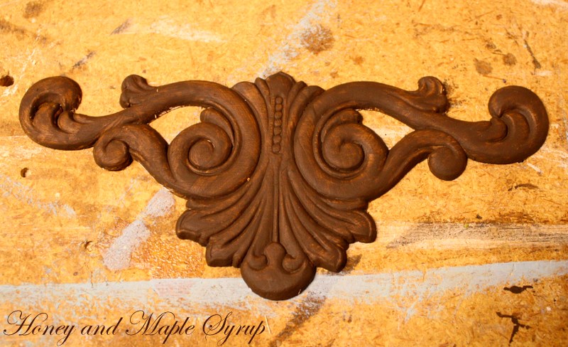
So, the first step was to figure out dimensions. I decided on an 11x17 inch piece of pine. Instead of painting the decorative part at the bottom, I chose to buy a wood applique to make it a little easier. The applique was 8" long so I knew that the 'flower' would need to be 8" wide. After priming the pieces, I placed the applique on the wood to make sure it was what I wanted.

Now, the tricky part is to get the shape of the flower. I used the picture I printed as inspiration and adjusted my drawing as needed to get the right dimensions. Since it's a symmetrical shape, you could probably even fold a piece of paper several times and draw 1 petal and then cut it out to get a uniform look.
I chose to use a beautiful blue as a basecoat and a dark chocolate brown for the flower.

I also painted the applique brown with the intention of painting the blue on top then sanding some off so that the brown would show through...buuuut, it didn't quite end up that way!
On to the flower. Like I said, this was *very* difficult for me since it's not my usual type of painting. I had to keep reminding myself of something an art teacher told me once which is to not see the object for what it is (a flower), but to see it as a shape (not quite the exact wording, but something like that!). So if you are reading this, Patricia Wood from American River College, thank you because that's what got me through this project! I have to admit that my heart was racing as I painted this because it looked so horrible and I kept wondering to myself how on earth I could ruin such a good idea. Sounds dramatic, but you'll see why when you look at the picture below.

Um yeah, quite a far cry from the Ballard Designs plaque! Fortunately, I am not usually one to give up when I have an idea, so next I decided to use a lighter shade of brown to highlight certain areas. The paint was called Trail Tan, but it was anything but tan! It looked more peach and that's when I *really* started freaking out! I kinda sorta forgot to take a picture of what it looked like at that point. Ok, not really. I didn't *want* to take a picture of it because it was so horrible! But once again, I couldn't just give up, so I decided I would paint over the peach and use white as a highlight instead. And while I was at it, I also used some dark brown, almost black, paint to do some lowlights, and this is what I ended up with.

I honestly wasn't sold on it at this point. I just kept thinking it looked so sloppy, but then reminded myself yet again that it isn't my usual style, and that to grow, I need to venture outside my comfort zone. And I also kept singing a song in my head from The Frog and the Princess...the part where Tiana checks out the place where her future restaurant will be and she sings the song, "Almost There". I didn't even realize for a while that I was humming that song in my head, but I think it was my subconscious way of pushing myself. That, and my son watches that movie EV.ERY.DAY! He loves the 'fwoggies' and 'algator' =).
Anyway, throughout the time I spent painting the flower, I was also working on the applique. It went from brown to this. (As I'm typing this, my son is looking at the picture and saying 'weird painting', so I guess he doesn't like this look either!).

When I had sanded it, it went straight to the primer even though I did a very light sanding. Plus, it blended in with the blue of the background a little too much. Next, I thought I would paint it mostly brown and just leave the cracks blue.

Hmmm, not liking that either. I finally took a cue from the flower and decided to highlight it with white and it turned out like this.


That's a little bit better, but I wanted more depth so I added just a smidgeon of brown paint and lightly sanded it again.
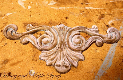

Much better! Next, I set it on the plaque to make sure it looked good, and I was pretty happy with it.

Then it came time to paint the dashed line and the random numbers, like on the original plaque (do this *before* attaching the applique so it doesn't get in the way). I used painter's tape to make a horizontal line and 2 vertical lines.

This step is *not* neccessary at all, but the perfectionist in me wanted to have the lines the same thickness. To keep it from being too 'perfect' looking, I varied the length of the lines and the spacing between them. I used a stencil that I already had to write '314' at the top and '0.100' between the dashed lines.

The next part kinda stunk because I didn't have a super small paintbrush so I used the other end of a paintbrush (the rounded plastic part) and a paintbrush on the bigger areas. It was far from perfect, but I was actually glad that it was kind of sloppy to match the look of the flower.
Once that was finished and dry, I painted some cardboard (aka a frozen pizza box that I cut open) with the colors of the plaque and tested out some wood stains to give it an aged look.

On the left is Minwax Early American and on the right is Minwax Dark Walnut. I thought the Dark Walnut was too dark for this project, but I honestly wasn't sure the Early American made a difference, so I held the plaque up to the samples.

Oh yeah, there's a difference! And just the right amount. So after I applied the applique with epoxy, I stained the whole thing with Early American then attached a picture hanger on the back when it was dry.
Here's the final product.


And the inspiration picture again.
I am happy to report that it has finally grown on me. In fact, I'm really diggin' it! Oh yeah, and the total cost of the project (the wood applique and 2 bottles of paint were all I had to buy) was a total of around $6!!! Although you have to buy the Ballard Designs version as a set for $199, *if* you could buy an individual plaque, it would cost $66! I'll take $6 over $66 anyday!
I'm linking up to


33 comments:
Love your post and your steps to get to the end. It definitly turned out amazing! I was actually thinking at the start that I would sooo buy that on etsy! -Cheryl
Niiice! I know it's not your usual style but you pulled it off very well! I like the way this project evolved, and I'm glad you went with the Minwax Early American - it was just right. Great job Ali, and I agree with Cheryl that you could easily sell an item like this on etsy!
Ali...this looks REALLY good! Looks so much like the original. Love the applique...gives it a nice touch! And...love the price!
Thanks guys! The Etsy idea is nice, but I don't think Ballard Designs would like me selling those! Haha. Maybe I could tweak it a litle bit. Hmmm.
OH MY OH MY! I LOVED these when I saw them in the Ballard Catalog! Yours is GREAT! I am totally inspired now...I want to go make some! Thanks for sharing!
~Bridgette
Amazing. Simply amazing. YOURS is 3D which makes them ultra unique. :)
Thanks for linking this up to SNS!
FJ Donna
I think it came out beautifully!!!! Great job!
You did a fabulous job!
Looks fantastic, great job!
Oh my gosh!!! Amazing!
m ^..^
Great job!!!
it's better than ballard's! I'll take 3!!!
I like it better than the Ballards!!! Awesome.
They turned out great! You don't have to be an artist, just need a little vision.
Wow! What an awesome job..I would hardly know that it wasn't from Ballard! Great work. I'm impressed!
all your projects are amazing to me!
i saw where donna @ funky junk put you on the side bar for highlights - well deserved!
hope you had a beautiful easter!
kellie
Wow! I wish I had your talent! Gorgeous!
ive just found your site - love your ideas, cant wait to see more!
This is truly beautiful.
Hi Ali! I was browsing thru CSI projects & really liked yours. Rather than just looking at your pics, I actually read your post, lol, and guess what! I live in Fair Oaks! When you said ARC I just had to read your bio. You're probably right down the street from me! I've been blogging a year and haven't met anyone near me so far. So, Howdy!
Love the art, btw! Your art teacher would be proud!
I love me a good Knock off. This is fabulous. I have been drooling over those in their catalog. Well done!
I think you did an awesome job! That is a fantastic knock off! I love the colors, too!
ooh - I really like it! great job!
Hay Ali! this is fabulous! so funny you live near me and I went to ARC for a short stint too. And so does colleen above! crazy... I am proud that Fair Oaks and the surrounding area have some much talent! a little yahoo is in order!
I hope you will enter this tutorial/project in my DIY Collective. it would be an amazing addition to the paintings tab under art/wall decor under accessories. hope you are having a nice week, neighbor!
Hi -- just saw this as I'm a new follower of your blog. I like Ballard Designs for the ideas, but I hate the prices! I may try doing this as well, although I have virtually no artistic ability. :) Thanks for the inspiration!
so glad this project is in the diy collective! fabulous! i featured it this afternoon to showcase it for my readers!
http://www.thedesignconfidential.com/2010/09/diy-collective-featured-art-and-wall-decor-.html
I have been eyeing these, I love them. Can I just say yours is amazing!! Great work, seriously! Thanks for the step by step, I MIGHT attempt this, but not sure if I can do as nice of job as you. Love it!
Wow, you did an amazing job. I have that clipped out and on my idea board for a future knock-off! I hadn't figured out how to pull it off yet!
wonderful job! I think it looks better than Ballards.
Congrats on your win at the CSI project. This looks amazing. You did a great job!
What a fabulous project. You really have a lot of talent, and I'm so glad I happened upon your blog. I've signed up to follow you and invite you to visit my blog and do likewise.
Hi. I just clicked over from Knock Off Decor and I love this. What a great idea. I'm a new follower. Hope you'll follow me back!
Hi! Just stopping by from Knock Off Decor. I have been drooling over these plaques ever since I got my catalog in the mail. Great job!
Post a Comment